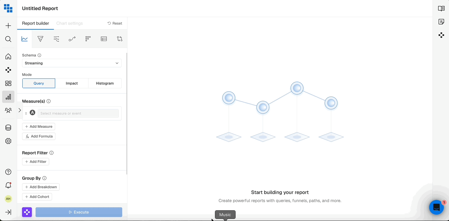
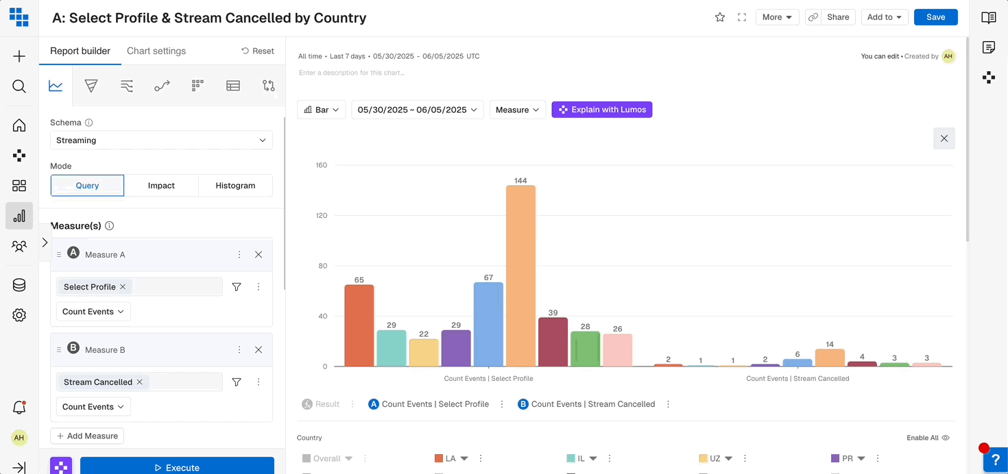
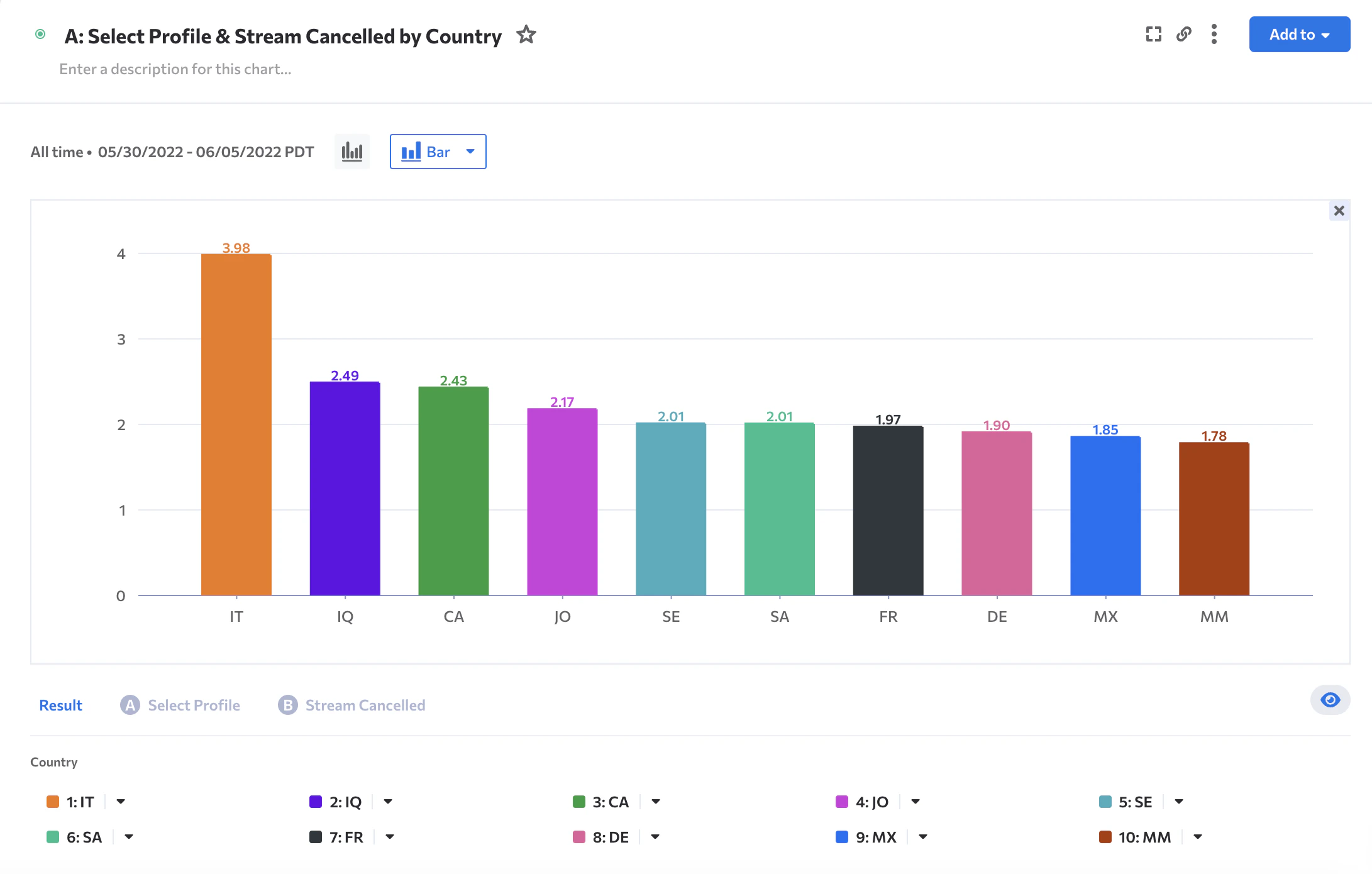
- Query - The standard report type that is explained in this help article.
- Impact Analysis - A valuable report method that let’s you see the impact of a particular metric before and after a user performs an event for the first time.
Impact Analysis
Within Impact Analysis the main use case is: “What is the impact to Metric A after a user engages with Event A?” More practically, here are a few examples from your favorite digital products:- What is the impact to Total Time Watched after a user is shown a Content Recommendation?
- What is the impact of Total Sessions after a user signs up?
- What is the impact of Customer lifetime value (LTV) after they purchase their first premium item?
Steps to build your Impact Analysis
- Change the Mode in Query to Impact Analysis.
- Choose the Metric you want to measure that is going to be impacted. Typically these are Sum, Count Event, or a Compound Measure, showing percent per User.
- Apply any necessary filters or breakdowns.
- Define the date range.
- Select the Event that is the Impact or “trigger” event. This will be the thing that you believe will Impact your metric you built in Step 1.
- Examples include Campaign Impression, Content Recommended, Signed In, etc.
- Execute the analysis!

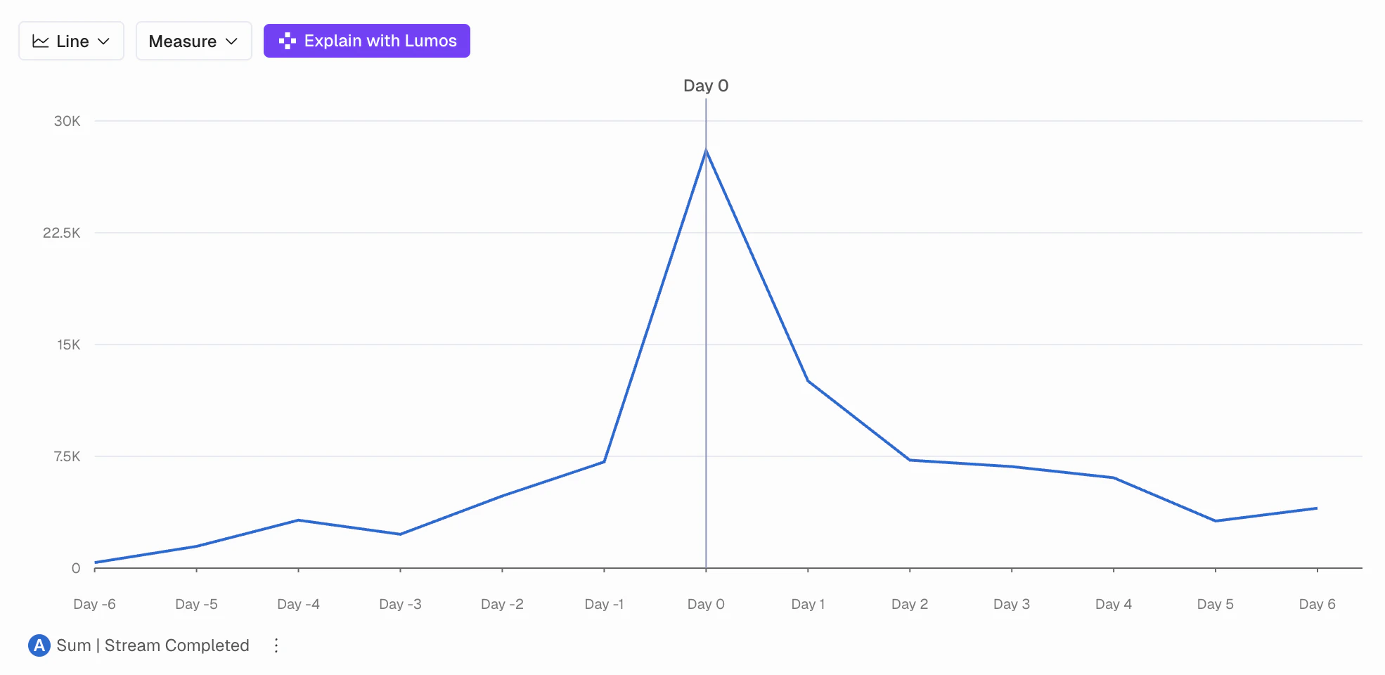
Interpreting Results of Impact Analysis
When you see the results what you see is the following:- A Day 0 indicator in the center of the chart showing that is was the first time in the period you selected that these users performed the “Enable Notifications” event.
- A negative and positive Day counter on either side.
- This shows the days less than or after the Day 0 event date. It could be different for each user as you’re selecting a date range so we normalize them for you.
- A line indicating the Metric (or Measure) you defined in Step 1.
- This will show IF the metric was impacted by the event you selected.
Histogram
- Oftentimes, understanding the number of users with a particular occurrence of an event or compound measure is helpful to understand distribution of engagement.
- In Kubit you can build Histograms on any Sum/Avg/Min/Max Functions
Steps to build your Histogram Analysis
- Change the Mode in Query to Histogram.
- Select the Metric you want to measure that is going to be impacted. Typically these are Sum, Count Event, or a Compound Measure , showing % per User.
- Select the Subject you want to analyze, this will be the “thing we are counting” that would perform the measure you create in Step 2.
- Choose your ‘Count Subject’ by in the y-axis
-
Choose your ‘Group By’ in the x-axis (Binning)
- You are able to use a pre-built Range if it’s applicable or create a custom one.
- These Bins will be related to the expected values from your Measure in Step 2.
- Ex. If you are counting events performed and a user typically only can do that action 10 times in a day then the max number of your Range would likely be 10.
-
Apply any necessary filters
- You cannot perform Breakdowns in Histogram Mode
- Select the date range
- Execute!
Interpreting Histogram Results
Once the histogram computes you’ll see the results grouped by the Range bins you created in Step 4. This means that each color group is all Subjects that fell into that Range for the day/week/month/all time.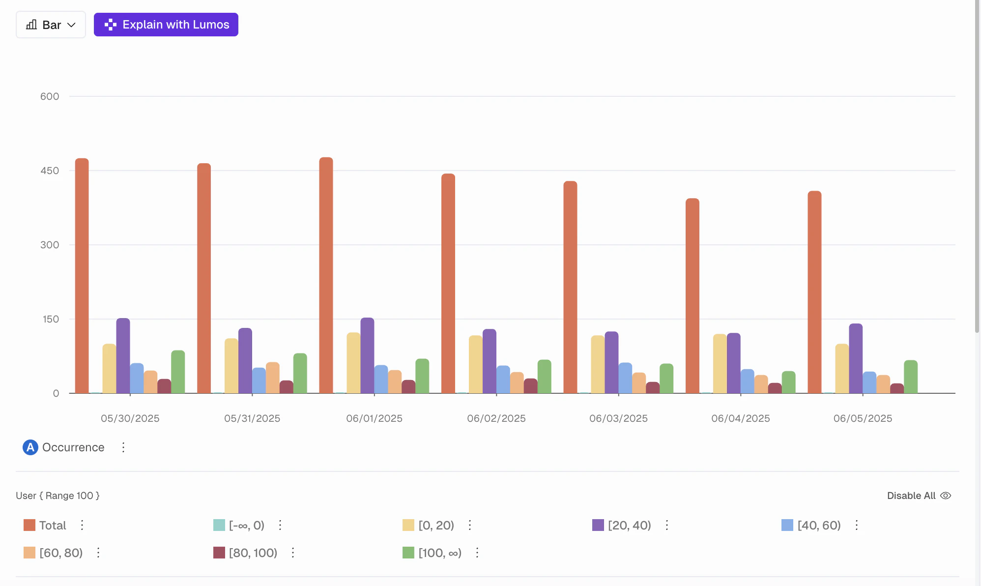
Create Cohort from that data point.
Custom Alert Monitors in Query
When a Query is monitoring critical KPIs it’s important to be alerted when a measure or compound measure dips below or above a certain threshold. Previously Kubit detected these anomalies using our own model but now you are able to set thresholds yourself!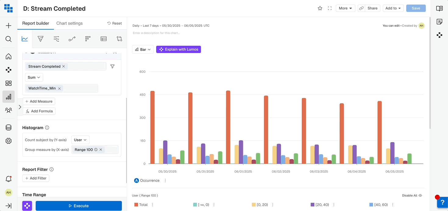
- Naming the Schedule.
- Setting the refresh timeframe.
- Adding recipients to the emails of that Report and any Alerts.
- Click “Custom Threshold Met”.
- Input the parameters, meaning if any value on the chart is Above/Below a specific number.
- You can also set Alerts based on percent change from the previous day by adding a Comparison Analysis to your Query.
Rolling Measures
Want to know what’s your weekly/monthly active users on a daily basis? Or what’s the moving average for any given day? Rolling Measures is a new feature designed to help you get those answers.Rolling Options
There are three options. For each, you are able to select from the pre-filled numbers or type in your own and select it.Rolling Average
For every day of the date range, do an average of the measure values for the last X days (including the current day).Rolling Sum
For every day of the date range apply, the Measure Function and do a sum of the Measure values for the last X days (including the current day).Rolling Window
For every day of the date range, apply the Measure Function over the date range window.How to Build a Rolling Measure
Build your Measure in Query and when selecting your Measure By option (under your selected event) you will see a Rolling option in the top right of the dropdown.- Select your Rolling option
- Select the pre-defined days or enter your own custom days and click the checkmark
- Execute your Query
Compound Rolling Measures
You’re also able to create multiple Rolling Measures and build formulas from their results. Here are a few examples:- Rolling DAU/WAU %
- Rolling 7 day Average of Unique Users divided by Rolling Window of 7 days of Unique Users
- Rolling DAU/MAU %
- Rolling 7 day Average of Unique Users divided by Rolling Window of 30 days of Unique Users
Measure Filters
Measure Filters allow you to easily exclude outliers, especially when breaking down ratios. Let’s consider the following example:

What’s Next